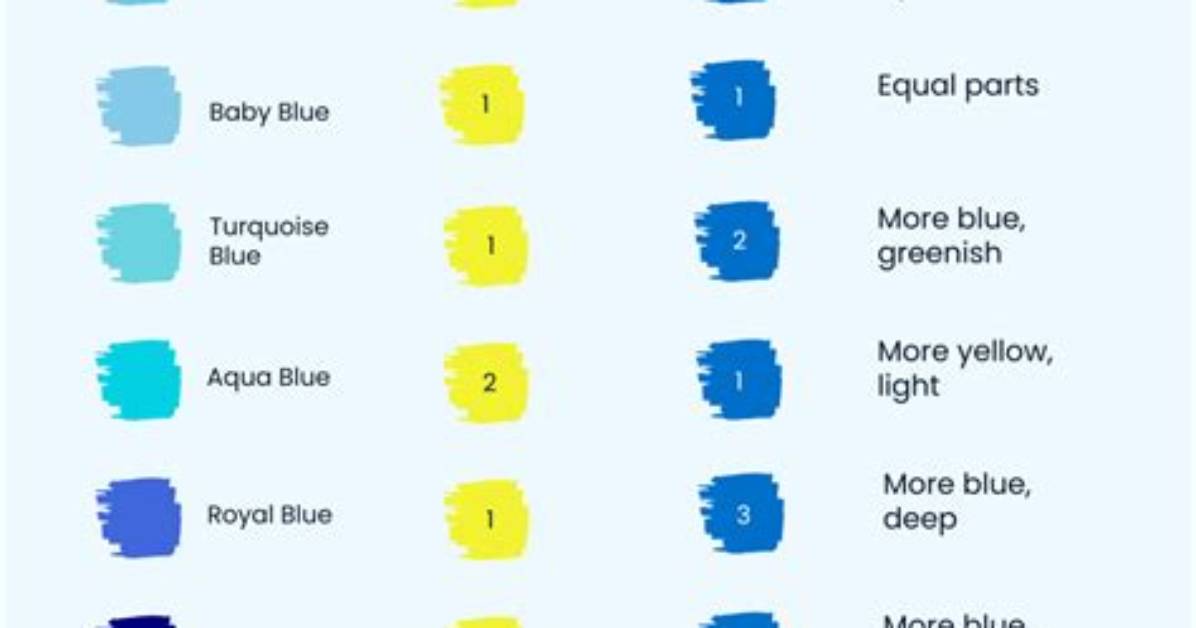
Varying the proportion of blue to green alters the psychological weight and visual temperature of the mixture. Color psychologists at Verywell Mind note that cool hues naturally suppress physical tension and encourage cognitive focus, but shifting toward green introduces organic, stabilizing associations with nature. Four core shades anchor this pigment spectrum:
Turquoise: Achieved through an even 1:1 ratio of a bright, cool cyan-leaning blue, such as cerulean, and an emerald or viridian green. Turquoise retains a balanced chromatic presence, reading as neither distinctly colder nor warmer than its surrounding accents.
Teal: Formed when blue dominates green at roughly a 3:1 or 4:1 ratio, often paired with a trace drop of black or burnt umber to drop the overall luminance value. Teal conveys architectural depth and formal gravity, which explains its continued dominance in cabinetry and structural woodwork.
Aquamarine: A pale, water-clear variant created by taking a 2:1 blue-to-green mixture and dispersing it into a heavy base of titanium white. The white pigment scatters light across the surface, pulling the high-chroma blue-green down into a soft, airy pastel.
Seafoam Green: Produced when green takes the lead at a 3:1 green-to-blue balance, diluted with white. Seafoam carries just enough blue to suppress the citrus punch of lime, yielding a weathered, botanical look that designers rely on for restorative environments.