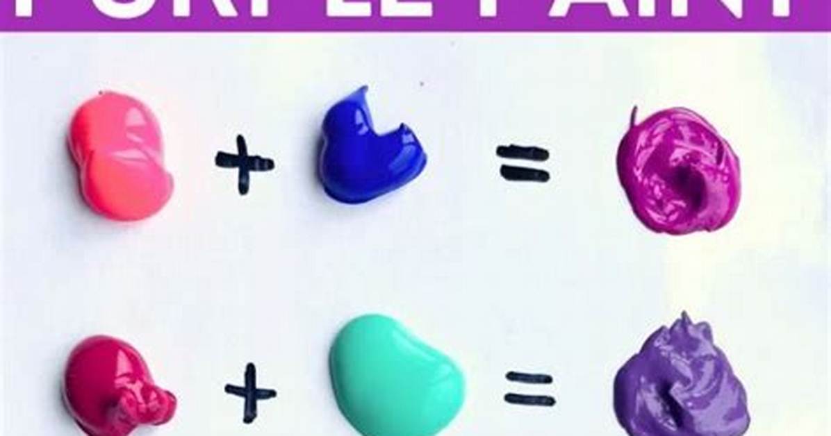
Varying the ratio between pink and purple unlocks four major tonal clusters, each carrying distinct aesthetic roles across fine art and industrial production:
A heavy concentration of saturated pink over purple yields vibrant magenta. In industrial chemistry, true primary magenta pigment (such as Quinacridone Magenta, pigment code PR122) is an unmixable primary in subtractive print systems. In studio painting, however, introducing a concentrated violet tint into a bright, warm pink replicates this blazing, high-visibility hue. It appears bright, punchy, and assertive.
Balancing pink and purple in an even split produces orchid and fuchsia. Fuchsia carries strong, hot red characteristics with a perceptible violet bite, whereas orchid introduces slightly more blue, giving the color a cool floral finish. The debate between fuchsia vs plum centers on value and saturation. Fuchsia demands maximum vibrancy and light reflectance, while plum pulls the blend into a deeper, moodier register by favoring concentrated dioxazine purple or ultramarine violet over soft pink.
Plum anchors the darker end of the berry color palette. It emerges when a small measure of pink softens a dominant dark purple, creating a luxurious tone reminiscent of blackcurrants or vintage wine. Mauve shades occupy the softest end of the spectrum. Mauve requires a pale, milky pink combined with a small measure of purple, creating a desaturated, smoky lavender with dusty rose undertones that softens interior spaces and editorial graphic layouts.